
Spare, clear, consistent signage can make all the difference in the donor experience…and your bottom line.
Sixty-four percent of customers become frustrated or view a brand less favorably when its signage is hard to read (“How Does Bad Signage Hurt Your Business?” Lextron Branding Solutions).
Stough can help you write, design and place your signs to enhance the donor experience and encourage donors to return.
1. Signs donors can read easily help them feel more comfortable and confident
Signage is one of those cases where less is more:
-
- By keeping your messages short, your signs are easy to read at a glance.
- Choose a size appropriate for the distance you expect your sign to be viewed from. Consider what obstacles may be in the viewers’ way.
- Avoid clutter. Fewer signs makes each one more impactful and enhances the environment. You want donors to feel calm, not agitated by a chaotic mess of confusing signs.
- Place signs at similar heights throughout the center so donors know where to look for important information.
Leave some “white space”:
-
- The area of a sign without text or graphics (can be color) is just as important as other design considerations.
- Resist the urge to “fill up” the available area with as many words as possible.
- 30-40% of the sign’s face area should be left white for optimal readability.
Choose an easy-to-read typeface:
-
- Clean, crisp, easy-to-read type styles should be used for maximum legibility.
- Do not use all capital letters. They are harder to read and come off as shouting.
- Use the smallest number of fonts possible in your various signs to make your space more soothing, cleaner and more attractive. Never use more than two typefaces on a single sign.

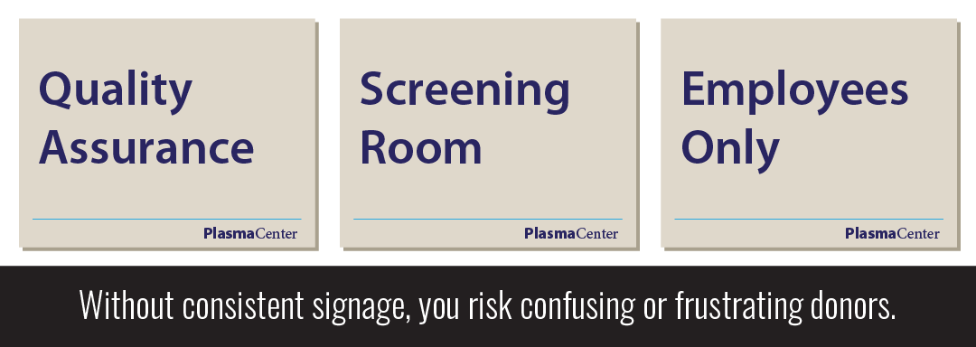
2. Consistent signage tells donors “You are important to us”
Consistency in signage is the key to creating a professional first impression:
-
- Signage that has been consistently designed and looks professional lends an air of respectability to your center. Donors enjoy spending time there.
- If you show you are serious about keeping your branding consistent, donors will assume you are just as professional in your plasmapheresis processes and have their comfort and safety top of mind.
- By staying within defined boundaries of design, your brand becomes a recognizable combination of colors, fonts and shapes that donors will remember when it is time to recommend a plasma collection center to friends.
- Create a template so all your signage looks similar. Always use the same fonts, colors, graphic styles and logo positioning. Keep signs the same size as much as possible.

3. Clear messages on clean signs improve the donor experience
According to Lextron, 55% of all consumers will drive past or dismiss an business altogether if the message on its signage is unclear.
-
- Clear directional signs minimize confusion and help donors feels confident.
- Put up only the messages that must be communicated via a printed sign. The remainder of communications should be human-to-human so donors feel valued.
- Avoid hand-written signs. They look unprofessional and can be hard to read, preventing your message from getting across.
- Before printing your sign, challenge yourself to convey the message with fewer words. For example, “If you have not yet registered, please stay in this space,” could be communicated with “Registration waiting area.”